| 1. This one is with the blue stroke added to the text. The stroke (blue edge) can be thicker but for me it already looks busy enough, I prefer it without any stroke but it's entirely up to you. This one is on a transparent background but I think only white would work, so that should be filled if used.
|

|
| 2. This is one colour on a transparent background and could work with either white or yellow. Good for a car sticker etc.
|

|
| 3. This is my personal favourite but I'm not sure whether it fits in with the LUST style. Probably only here to show the versatility of the design when it comes to colours.
|

|
| 4. The three examples below look like they have three colours and immediately it looks more Leeds United. I personally think you shouldn't go this route (using the three colours) I think as an organisation that's independent of the actual club it's important to have your own identity. Using any two colours on any given design from a palette of three (yellow, white and blue) I feel would best represent LUST, it is still recognisable as Leeds Utd but not quite Leeds United (the official branding). The designs below though are transparent where it is white and these could work as long as the background is not white! and I feel they are good for most stock and surface.
|

|
| 5. Another version, colours can be varied.
|

|
| 6. ...and another, colours can be varied.
|

|
| 7. I like this one, I think it would make a great car sticker, it's just one colour the rest is transparent and it would look good using yellow or white.
|

|
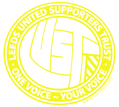
| 8. Good work on the line by the way, I like that. I know what you are saying about using the web address, unless any web address is just one word, or four or less letters long most people will forget the Url, more so in this case as well because it is a .org, most people still only think in .com and .co.uk. So if that's the point of having the url there then I think it is a bit of a waste. The strap you came up with is better and probably will have a better pulling power. This design is an option to keep the url in there. It's the same as the design above but has the url running around the outer perimeter. This would be good for media such as flyers etc. where you want to get the word out on paper. The Url might be a bit hard to see on this one as it is on the yellow design but of course would stand out on a dark background.
|

|
I stopped there because the possibilities are endless but I hope there is something there you can work with. As before I have them all on high res. raster and vector and the text can be changed. If you come up with anything else you want to try just let me know. |
